Case study · Circuit City

I brought an old American retail giant back to life.

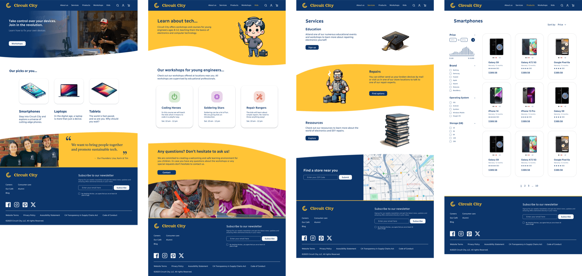
For Circuit City I transformed the brand from a traditional electronics retailer into a modern hub for refurbished electronics and DIY repair workshops, leaning into sustainability, community, and education to meet a growing demand for affordable and responsible tech.
Scope
Oct 2022 – Dec 2023 · Solo project
Tools
Figma, Wireframing, Design Thinking, Prototyping
Role
Brand & Product Designer
Circuit City rebrand composition
Background

What caused Circuit City to go bankrupt?

Circuit City collapsed in 2008 due to outdated strategies and fierce competition from Best Buy. My proposed revival pivots the brand towards the growing refurbished electronics market, layered with educational workshops and a community hub for tech enthusiasts: a circular economy model rather than a pure retail model.
Audience

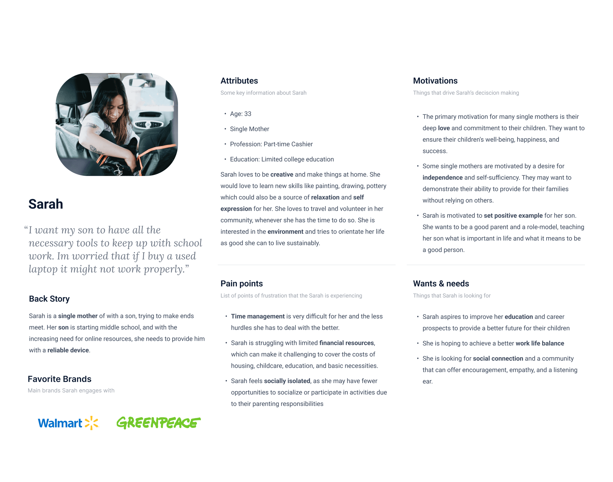
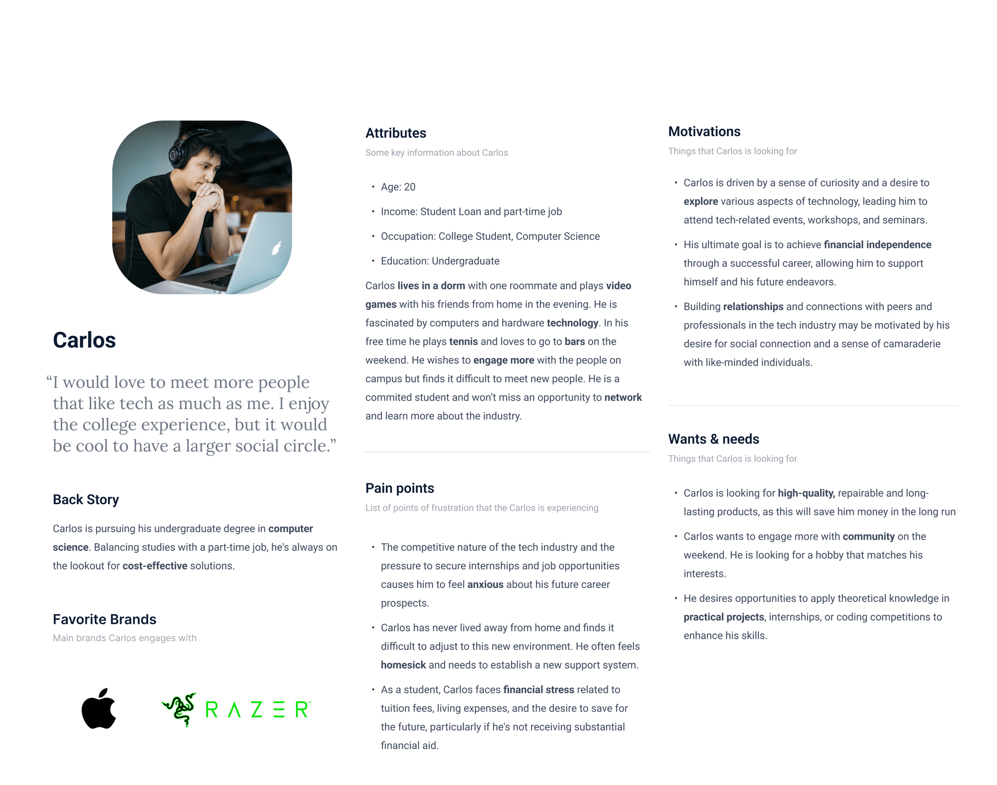
Meet Sarah and Carlos: my personas.

The target demographic is younger North Americans aged 18 to 45, plus their children for weekend workshops. Sarah, a 33-year-old single mother, needs an affordable laptop for her son. Carlos, a 20-year-old CS student, needs affordable phone repair and new social connections. These personas, built from competitor research, guided the customer journeys and touchpoints.
Sarah persona card
Carlos persona card
Journey

Carlos's journey helped me identify every touchpoint.
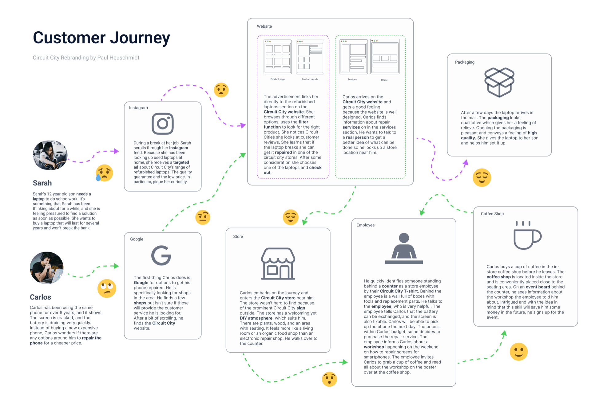
I sketched two customer journeys: Sarah's purely digital path towards buying a refurbished laptop, and Carlos's hybrid journey visiting the store, interacting with staff, and buying coffee at the in-store café. Seeing them side-by-side made clear which touchpoints needed design love, and which could stay lightweight.
Customer journey map
Layout

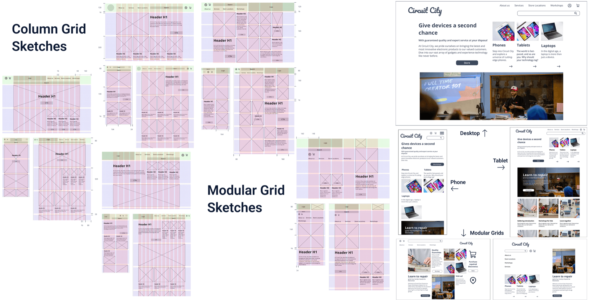
Grid system explorations.

I wanted to move away from the original red/black/white scheme and find something more grounded and friendly. I oscillated between experimental, editorial grids and stiffer corporate layouts, and landed on a column grid system that prioritized clarity and scannability without losing personality.
Grid system explorations
Playing with layouts to find a fit for the new Circuit City.
Identity

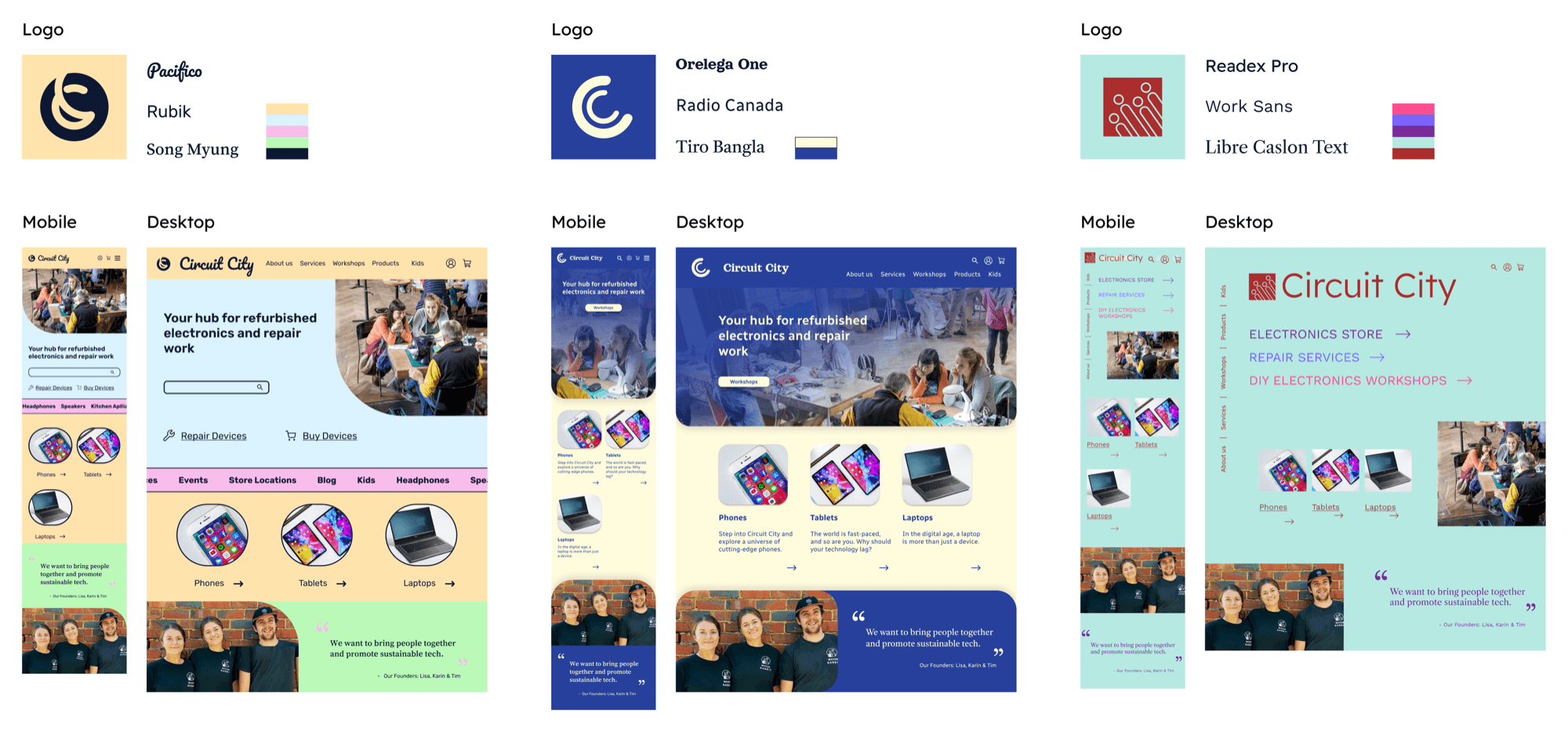
Color, logo, typeface: playful, warm, quality.
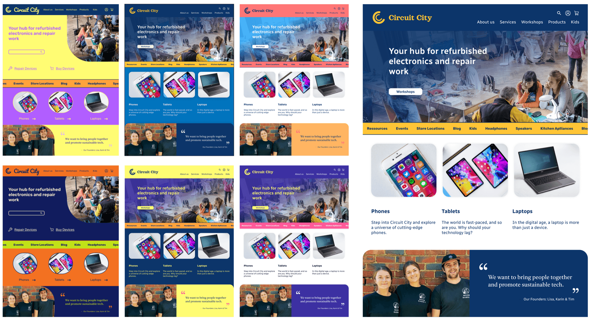
I explored pastels, neon, and even an avant-garde palette before settling on a blue / yellow / white scheme. Despite the surface similarity to Best Buy, Circuit City's shift to repair, education, and refurbished tech differentiates it clearly. The logo leans on the playful yet sophisticated 'Orelega One' serif; body text uses the legible 'Radio Canada'; quotes pick up 'Tiro Bangla' for warmth.
Circuit Blue#0C356A
Workshop Yellow#FFC436
Paper White#FFFFFF
Further color explorations
Category landing page
Key Takeaways

What this project taught me.

01

Know exactly who you're designing for.

Shaping a brand's voice through color, grid, and language only works when the audience is vivid. If I had more time I'd validate Sarah and Carlos through research and even design the in-store repair environment.

02

Customer journeys surface the gaps.

Drawing both Sarah's and Carlos's paths end-to-end exposed touchpoints I'd have missed if I'd jumped straight to screens.

03

Visual design is a rep.

This project was an excuse to practice typography, color systems, and layout at volume, and the craft muscle paid off.

04

Tone is a feature.

Striking the right voice (warm, grounded, confident) mattered more than any single visual decision.

Next project

MileOne

A mobile app that supports new runners with a personalized experience.